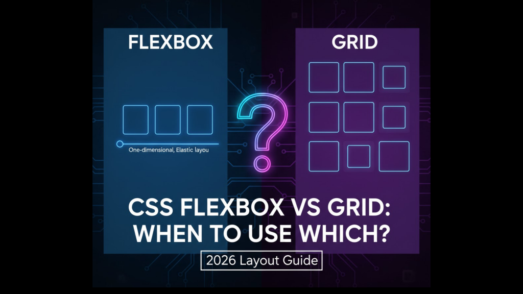
Modern web design in 2026 relies on two powerful engines: CSS Flexbox vs Grid: When to Use Which? Choosing the wrong tool can lead to messy code and broken layouts. While they might seem similar at first glance, they are designed for very different tasks. One handles content flow, while the other handles architectural structure.
At WeBlogTrips, we want you to build websites that are both beautiful and performant. In this guide, we will settle the CSS Flexbox vs Grid: When to Use Which? debate by looking at real-world use cases, performance metrics, and the best ways to combine them.
⚡ CSS Flexbox vs Grid: When to Use Which? Comparison Table
This table provides a high-level overview of CSS Flexbox vs Grid: When to Use Which? to help you make a quick decision for your next project.
| Feature | CSS Flexbox | CSS Grid |
| Dimensions | One-Dimensional (Row or Column) | Two-Dimensional (Row and Column) |
| Control | Content-First (Items drive layout) | Layout-First (Parent drives layout) |
| Best For | Navigation bars, buttons, small components | Full-page layouts, dashboards, galleries |
| Responsiveness | Items wrap naturally | Requires explicit grid templates |
| Complexity | Easy to learn and implement | Steeper curve, more powerful features |
1. CSS Flexbox vs Grid: When to Use Which? for One-Dimensional Layouts
The most important rule in CSS Flexbox vs Grid: When to Use Which? is dimensionality. Flexbox is designed to align items in a single line. Whether it is a horizontal navbar or a vertical list of cards, Flexbox excels at distributing space along one axis.
If your content needs to grow, shrink, or wrap based on its own size, Flexbox is the answer. This “content-first” approach is a major factor when deciding CSS Flexbox vs Grid: When to Use Which? for micro-layouts.
2. CSS Flexbox vs Grid: When to Use Which? for Two-Dimensional Structures
When you need to control both rows and columns simultaneously, the winner of CSS Flexbox vs Grid: When to Use Which? is definitely CSS Grid. Grid allows you to build a blueprint first and then place content into specific cells.
Think of a complex news site with a header, sidebar, main content, and footer. Trying to build this with Flexbox requires deep nesting of containers. Grid solves this by managing the entire page architecture from a single parent element. This structural power is why developers prefer Grid when asking CSS Flexbox vs Grid: When to Use Which? for macro-layouts.
3. CSS Flexbox vs Grid: When to Use Which? for Performance and Maintenance
In 2026, performance differences between CSS Flexbox vs Grid: When to Use Which? are mostly negligible for small sites. However, for massive, data-heavy apps, Grid can sometimes be more efficient because it reduces the number of HTML elements (no more “wrapper” divs inside wrappers).
Maintainability is another key part of CSS Flexbox vs Grid: When to Use Which?. Grid layouts are often easier to read at a glance because the entire structure is defined in the CSS of the parent container, rather than being spread across multiple child elements.
Frequently Asked Questions (FAQ)
1. Can I use Flexbox inside a Grid?
Absolutely! In fact, the “Secret Sauce” of 2026 web design is using both. You use Grid for the overall page skeleton and Flexbox for the alignment of items inside each grid cell.
2. Is Flexbox easier for mobile responsiveness?
Flexbox is great for simple “stacking” behaviors (turning a row into a column on mobile). However, Grid’s grid-template-areas makes it incredibly easy to rearrange an entire page layout for different screen sizes with just a few lines of code.
3. Why does my layout break on iPhone?
If you are using cutting-edge CSS features like Subgrid without a fallback, you might trigger an Apple Security Warning on your iPhone if your browser is outdated. Ensure your site uses a Best Website Hosting 2026 provider to serve optimized assets to all devices.
Final Verdict: CSS Flexbox vs Grid: When to Use Which?
The choice of CSS Flexbox vs Grid: When to Use Which? comes down to your layout’s intent:
- Use Flexbox for alignment, flow, and single-direction components.
- Use Grid for structure, precision, and complex page-wide architectures.
More From Weblogtrips
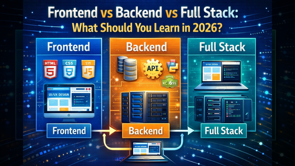
- HTML vs HTML5: What’s the Real Difference?: The foundation that holds your CSS.
- Frontend vs Backend vs Full Stack 2026 Guide: Why layout skills are vital for frontend developers.
- Apple iPhone Security Warning Guide: Keeping your CSS-heavy site safe.
- What Happens When You Type a URL in a Browser: How the browser parses HTML5 code.
- Top 5 Free AI Logo Makers in 2026: Brand Your Business for $0
- Top 5 Free AI Website Builders in 2026: Build Your Site in Minutes
- Top 5 Free Text to Image and Video Platforms in 2026: Create Masterpieces for $0
- Top 5 Free AI Platforms 2026: Complement your audio with AI writing tools.
- Best & Safest Free VPNs 2026: See the difference between free and paid options.
- Best Website Hosting 2026: Secure your own digital infrastructure.
External Links
- Flexbox Froggy: A fun, interactive game to master Flexbox alignment.
- CSS Grid Garden: The best way to learn Grid-based positioning.
- MDN: Relationship of Grid to Other Layouts: Official documentation on combining these tools.