What are CSS Container Queries?
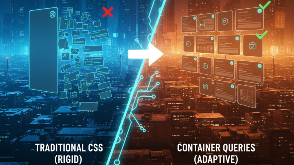
Container queries allow you to style an element based on the size of its parent container rather than the entire browser viewport. In 2026, with 96% global browser support, they have replaced media queries as the primary tool for building responsive components. Instead of asking “How wide is the screen?”, your CSS now asks “How much space do I have in this specific div?”.
This shift moves web development from a “top-down” (page-first) approach to a “bottom-up” (component-first) architecture, significantly reducing code complexity and maintenance.
Media Queries vs. Container Queries: The 2026 Verdict
In the “Agentic Era” of 2026, media queries are reserved for global page layouts (like showing/hiding a sidebar), while container queries handle the internal logic of every UI element.
| Feature | Traditional Media Queries (@media) | Container Queries (@container) |
| Logic Basis | Viewport/Screen Width | Parent Element Width |
| Reusability | Low (Breaks outside specific pages) | Infinite (Drop it anywhere) |
| Code Cleanliness | Many “Magic Number” breakpoints | Local, context-aware rules |
| JS Dependency | High (for complex parent-logic) | Zero (Pure CSS) |
| Main Use Case | Global Page Layouts | Component Libraries/Design Systems |
How to Implement Component-First Logic
To use container queries in 2026, you follow a two-step “Container-Child” relationship.
1. Define the “Containment Context”
You must tell the browser which element it should monitor. You do this with the container-type property.
inline-size: The most common choice; it monitors the width of the parent.size: Monitors both width and height (ideal for resizable widgets or chat windows).
2. Write the @container Rule
Once the parent is defined, the child elements can query it just like a media query:
CSS
.card-parent { container-type: inline-size; }

@container (min-width: 400px) {
  .card { display: flex; flex-direction: row; }
}
In this example, the card stacks vertically by default, but automatically switches to a horizontal layout the moment its container exceeds 400px—regardless of whether the user is on a phone or a 4K monitor.
Frequently Asked Questions (FAQ)
1. Is @media dead in 2026?
No. Media queries are still essential for “macro-layouts” (e.g., changing the overall page structure based on device orientation) and for querying user preferences like prefers-color-scheme or prefers-reduced-motion.
2. What are cqw and cqi units?
These are Container Query Units. 1cqi is equal to 1% of the container’s inline size (width). They allow for “Fluid Typography” that scales perfectly relative to the component’s size, not the screen’s.
3. Can a container query itself?
No. An element cannot be both the container and the thing being queried for size changes. You must always query a parent or ancestor.
4. Why do I see an Apple Security Warning during CSS testing?
If your dev tools attempt to override system-level rendering behaviors or access hardware-level display identifiers on an iPhone without proper permissions, you may trigger an Apple Security Warning on your iPhone.
5. What is “Style Queries” in 2026?
A stable 2026 feature of container queries that allows you to query the computed style of a parent (like its background color or a CSS variable) rather than just its dimensions.
6. Do container queries affect performance?
In 2026 browsers, they are hardware-accelerated. However, for maximum performance, use inline-size instead of size to avoid unnecessary “layout loops” involving height calculations.
7. What happens if there is no defined container?
If a child has a @container rule but no parent has a container-type, the query will default to the viewport, acting essentially like a standard media query.
8. Can I name my containers?
Yes. Use container-name: sidebar; to ensure a component only responds to a specific ancestor, preventing it from accidentally reacting to a closer, nested container.
Final Verdict: Modular Freedom is Here
In 2026, Container Queries have finally realized the dream of “Build Once, Deploy Anywhere.” By making your components context-aware, you eliminate thousands of lines of fragile media query code and build a design system that is truly future-proof.
Ready to build modularly? Check out our guide on Next.js 16 vs. Nuxt 4 to see how these frameworks handle component-first CSS, or learn the Top Dev Skills Needed to Shine in 2026.
Authority Resources
- MDN Web Docs: CSS Container Queries – The definitive technical reference for syntax and properties.
- web.dev: Lessons from the Netflix Team on Container Queries – Real-world case study on moving from top-down to bottom-up design.
- OddBird: Container Queries and Units in Action – Advanced patterns from the co-authors of the CSS specification.
- LogRocket: Container Queries in 2026 – A deep dive into performance, style queries, and best practices.