What is Mobile-First Design in 2026?
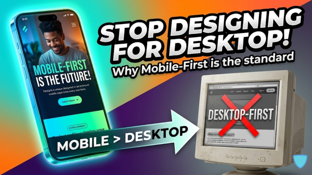
Mobile-first design is a methodology where you start the design process for the smallest screens and progressively enhance the experience for larger devices. In 2026, this is the industry standard. Unlike “Desktop-First” (Graceful Degradation), which tries to shrink a complex site into a small phone, Mobile-First (Progressive Enhancement) ensures that your core content is fast, focused, and functional from the beginning.
In 2026, designing for desktop first is like building a skyscraper and then trying to fit it into a briefcase, it results in cluttered, slow, and broken experiences.
Why Desktop-First is Failing in 2026
Traditional desktop-centric design assumes a “perfect environment”, large monitors, high-speed Wi-Fi, and precise mouse clicks. However, the 2026 reality for most users is a smartphone on a 5G/6G network with touch interactions.
| Feature | Desktop-First (Legacy) | Mobile-First (2026 Standard) |
| Strategy | Graceful Degradation (Removing) | Progressive Enhancement (Adding) |
| Priority | Visual Flourish & Hover Effects | Performance & Fast Loading |
| User Context | Stationary & Focused | On-the-go & Distracted |
| Input Method | Precise Mouse Clicks | Fat-Finger Friendly Taps |
| SEO Impact | Penalized for Mobile Bloat | Ranked Primary by Google |
The 3 Pillars of Mobile-First Success
To build a high-performance site today, you must ruthlessly prioritize these three elements.
1. Content Ruthlessness
Mobile screens have no room for “fluff.” You must identify the most critical actions—like “Buy Now” or “Book Appointment”—and place them front and center. Consequently, this forces a clear visual hierarchy that benefits all users, even those on desktops.
2. Touch-First Navigation
Cursors are precise; thumbs are not. In 2026, all interactive elements must have a minimum target size of 44×44 pixels. Furthermore, you must eliminate “Hover States” entirely, as they do not exist on touchscreens and often break mobile navigation menus.
3. Performance-First Coding
Mobile users are hyper-impatient, with a tolerance of only 2 to 3 seconds before they bounce. By starting with a mobile-first codebase, you naturally create leaner, faster sites that prioritize Interaction to Next Paint (INP) and stable layouts.
Frequently Asked Questions (FAQ)
1. Is responsive design the same as mobile-first?
No. Responsive design is a technical tool (using media queries). Mobile-first is a design strategy. You use responsive design to implement a mobile-first strategy.
2. What is Google’s Mobile-First Indexing?
It means Google primarily uses the mobile version of your site to determine your rankings. If your mobile site has less content than your desktop version, your SEO will suffer significantly.
3. Do I still need a desktop version in 2026?
Yes. Mobile-first doesn’t mean “mobile-only.” It means starting with the phone and then adding “bells and whistles” for the desktop version once the core experience is solid.
4. Why do I see an Apple Security Warning on my mobile site?
If your mobile-first site uses insecure tracking pixels or non-encrypted form submissions, you may trigger an Apple Security Warning on your iPhone.
5. What is the “Thumb Zone”?
The Thumb Zone is the area of a phone screen that is easiest to reach with one hand. In 2026, primary actions and navigation menus are placed at the bottom of the screen to accommodate how people naturally hold their devices.
6. Should I use 16px font on mobile?
Yes. In 2026, 16px is the minimum standard for body text. Anything smaller often forces the browser to “auto-zoom” when a user taps a form field, which creates a frustrating user experience.
7. Does mobile-first design save development costs?
Yes. It is much easier and cheaper to scale a simple, fast mobile site up to a desktop version than it is to fix a cluttered, broken desktop site for mobile.
8. What is “Vibe Coding” for mobile?
This is a 2026 term for intent-driven development where you use AI to generate the initial mobile-first layout based on a simple prompt, allowing you to focus on the fine-tuning and performance optimization.
Final Verdict: Start Small to Grow Big
In 2026, Mobile-First is the only way to build for the modern world. By embracing the constraints of the small screen, you create faster, more accessible, and higher-converting websites that satisfy both your users and search engines.
Ready to build for the future? Explore our guide on Converting Your WordPress Site into a High-Performance PWA or learn the foundational skills in How to Become a Web Developer in 2026.
Authority Resources
- Trinergy Digital: Mobile-First UX Best Practices for 2026 – Detailed principles for minimalist, touch-friendly interfaces.
- Steve Ferguson SEM: The Mobile-First Website Advantage – Analysis of mobile-first indexing and the shift in user behavior.
- Convergine: Complete Guide to Mobile-First Design 2026 – Comparing mobile-first, mobile-friendly, and responsive approaches.
- MobiLoud: Global Mobile Web Traffic Statistics 2026 – The latest data on device market share and regional differences.