What is Foldable Web Design in 2026?
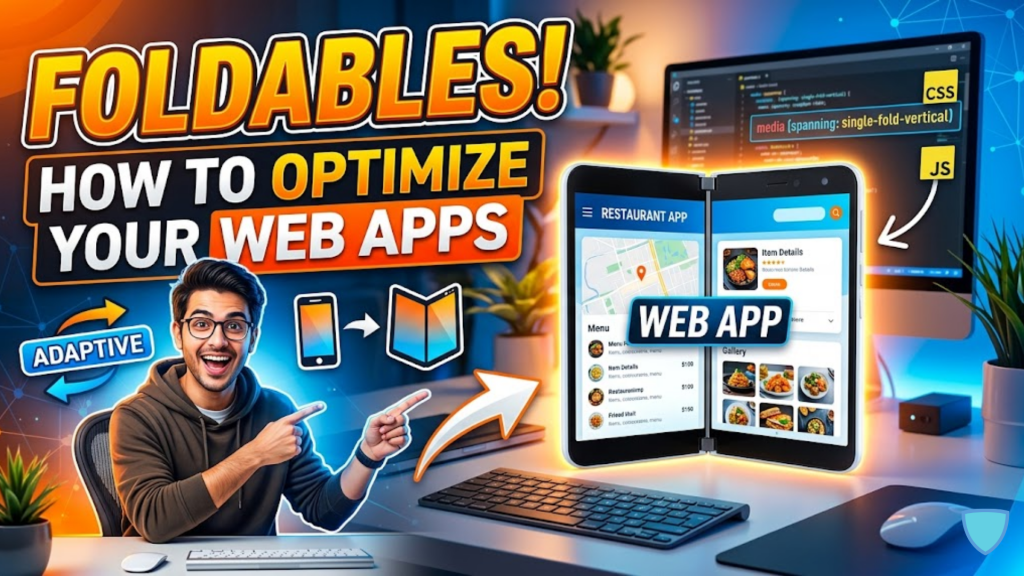
Foldable design is an evolution of responsive web design that takes physical hardware features, like hinges and screen folds, into account. In 2026, we no longer treat a foldable device as a single large tablet. Instead, we use the Viewport Segments API to detect the “seam” of the device. This allows us to place content logically on either side of the fold, preventing text from being cut off or images from being “bent” by the hardware.
The goal is to embrace the “posture” of the device, whether it is open like a book or propped up like a laptop.
The 2026 Toolbox: Viewport Segments and Env Variables
To build for foldables, you must move beyond standard width-based media queries. In 2026, we use specialized CSS features to detect the physical state of the device.
1. The Viewport Segment Media Queries
You can now detect if the browser window spans across multiple physical displays.
horizontal-viewport-segments: Detects side-by-side screens (Book Posture).vertical-viewport-segments: Detects top-and-bottom screens (Laptop/Tabletop Posture).
2. Geometry Environment Variables
Once you detect a fold, you need to know exactly where it is. Six new CSS environment variables allow you to calculate the geometry of each segment:
env(viewport-segment-width 0 0): The width of the first screen.env(viewport-segment-left 1 0): The starting position of the second screen.
3. The Device Posture API
Through JavaScript, you can now detect the “angle” of the fold. If a user half-folds their device into a “Tabletop” position, your app can automatically move the video player to the top half and the controls to the bottom half.
3 Layout Strategies for Dual Screens
In 2026, successful foldable apps follow these “Hardware-Aware” patterns:
- The Two-Pane Master: Perfect for email or messaging. Use the fold as a natural divider between your “List View” (left segment) and your “Detail View” (right segment). This eliminates the need for a “back” button.
- The Hinge Guard: If a device has a physical seam (like the Surface Duo), you must ensure no text falls behind it. Use
env(viewport-segment-width)to set your grid columns so content “snaps” to the edges of the hinge. - The Extended Canvas: For maps or creative tools, use the entire spanned area but keep the primary controls on the “Master” viewport (the segment the user is likely holding) to avoid accidental touches near the fold.
Frequently Asked Questions (FAQ)
1. Do I need to design for every foldable device?
No. By using the Viewport Segments API, your design responds to the number of segments and their geometry rather than specific device names. This makes your code future-proof for any new 2026 hardware.
2. Is this just for Microsoft Edge?
While Microsoft and Samsung pioneered these standards, in 2026, Chrome 138+ and other major browsers have fully shipped the Viewport Segments API, making it a cross-platform standard.
3. How do I test foldables without buying the devices?
Open Chrome DevTools, go to Device Emulation, and select “Surface Duo” or “Samsung Galaxy Z Fold.” You can then toggle the “Spanned” mode to see how your segments and environment variables react.
4. Why do I see an Apple Security Warning on my foldable layout?
If your layout script attempts to query hardware-level sensors (like the hinge angle) without a secure HTTPS connection, you may trigger an Apple Security Warning on your iPhone.
5. What is “Book Posture” vs. “Tabletop Posture”?
“Book Posture” is when the fold is vertical (screens are side-by-side). “Tabletop Posture” is when the fold is horizontal (one screen is tilted up like a laptop).
6. Can I use CSS Grid with foldables?
Yes! CSS Grid is the best tool for this. You can define your grid-template-columns using the env() variables to ensure your layout perfectly aligns with the physical hinge.
7. Does this affect my site’s SEO?
Google’s 2026 “Multi-Device Indexing” rewards sites that provide tailored experiences for premium hardware. A foldable-optimized site often sees higher engagement time, which is a positive ranking signal.
8. What is the “Seam” vs. the “Fold”?
A Seam is a physical gap between two separate screens (dual-screen). A Fold is a continuous flexible display that bends (foldable). In 2026, the Viewport Segments API handles both identically.
Final Verdict: Beyond the Single Screen
In 2026, the web is no longer flat. By optimizing for foldable devices and dual screens, you move from “responsive” to “adaptive.” You create interfaces that respect the physical reality of the hardware, providing a luxury experience that defines the next era of mobile productivity.
Ready to build for the future? Explore our guide on How to Become a Web Developer in 2026 or learn about the latest performance standards in Interaction to Next Paint (INP): The New Core Web Vital.
Authority Resources
- Microsoft Edge: Foldable and Dual-Screen Device Guide – The technical foundation for the spanning media features.
- Chrome for Developers: Viewport Segments API Shipped – Official update on the API availability and usage.
- Samsung Internet: Folding the Web – Early insights into posture-based design from the foldable market leader.
- Smashing Magazine: Building Web Layouts for Dual-Screen Devices – Comprehensive patterns for grid placement and hinge safety.