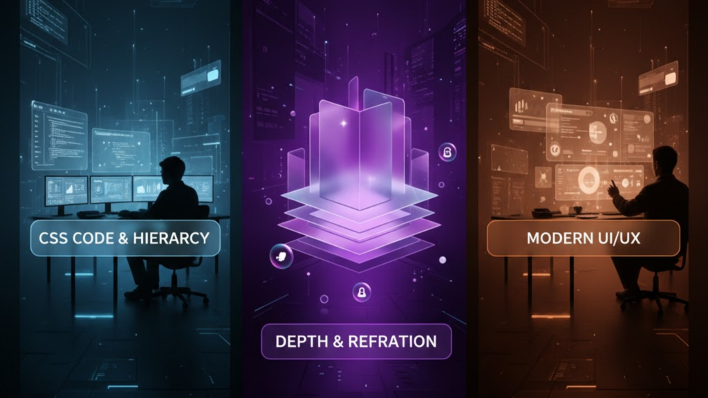
What is Glassmorphism 2.0?
Glassmorphism 2.0 is the 2026 evolution of the “frosted glass” aesthetic. While version 1.0 relied on simple blurs, Glassmorphism 2.0 focuses on surface transduction—the realistic way light interacts with digital materials. It uses advanced CSS techniques like relative color syntax, mask-image gradients, and multi-layered backdrop filters to create interfaces that feel tactile, dimensional, and premium without the performance lag of previous eras.
In 2026, this style has matured from a “cool effect” into a functional tool for establishing visual hierarchy in complex dashboards and mobile apps.
3 Pillars of Glassmorphism 2.0 Implementation
To achieve a “Liquid Glass” look that meets 2026 standards, you must move beyond a simple opacity: 0.5. Follow these three technical pillars:
1. The Multi-Layer Transparency
Beginners often use a solid grey color with low opacity, which results in a “washed out” look.
- The 2.0 Way: Use Alpha-channel gradients. Specifically, your background should be slightly lighter at the top-left (mimicking a light source) and darker at the bottom-right. This creates an immediate sense of physical thickness.
2. Optical Blur and “Lensing”
The magic happens with backdrop-filter: blur(), but 2.0 adds Refraction.
- The Strategy: Use a moderate blur between 10px and 20px. To simulate realistic glass lensing, pair the blur with a slight
saturate(150%)orbrightness(1.1). This makes the colors behind the glass “pop” rather than just becoming grey mud.
3. The “Light Catcher” Border
Glass has edges that catch light. In 2026, we simulate this with a dual-border technique.
- The Code: Use a 1px solid border with a very low opacity white:
border: 1px solid rgba(255, 255, 255, 0.12). For extra realism, useborder-imagewith a linear gradient so the “shine” only appears on one corner.
Performance: Keeping the Glass Snappy
Rendering real-time blurs is GPU-intensive. If you have 50 glass cards, your users’ device fans will spin up. Consequently, you must optimize.
- Hardware Acceleration: Use
transform: translateZ(0)to force the browser to offload rendering to the GPU. - Selective Blurring: Only apply
backdrop-filterto the top-level cards. Use standard semi-transparent backgrounds for secondary elements. - Will-Change: Apply
will-change: backdrop-filteronly when an element is animating. This tells the browser to prepare for the heavy lifting.
Solving the “Glass Ceiling” (Accessibility)
The biggest criticism of glassmorphism is poor legibility. In 2026, we follow the “Accessibility First” rule for glass.
- Text Contrast: Never place text directly on a 10% opacity background. Instead, add a semi-opaque “film” (approx. 30% opacity) behind the text itself to dampen background noise.
- Visual Cues: Don’t rely solely on transparency to indicate a button. Use subtle shadows and borders to define the shape clearly for users with visual impairments.
- User Preferences: Always respect the
@media (prefers-reduced-transparency)query. If a user has this enabled, fallback to a solid, high-contrast background.
Frequently Asked Questions (FAQ)
1. What is the “sweet spot” for blur in 2026?
Most designers find that 12px to 16px is the ideal range. It provides enough “frost” to make text readable without completely obscuring the vibrant background colors.
2. Why does my glass look “dirty” on dark backgrounds?
This usually happens because of “Grey Wash.” Instead of using a white tint for dark mode glass, use a deep blue or purple tint with 10% opacity. This maintains the “atmospheric” depth.
3. Does backdrop-filter work in all 2026 browsers?
Yes, support is now universal. However, you should still use a fallback for safety:
@supports not (backdrop-filter: blur(10px)) { .card { background: rgba(255,255,255,0.9); } }.
4. Why do I see an Apple Security Warning on my glass UI?
If you use non-standard CSS filters that attempt to access hardware-level rendering buffers in an unencrypted environment, you may trigger an Apple Security Warning on your iPhone.
5. What is “Liquid Glass”?
Liquid Glass is a 2026 evolution where the glass panels react dynamically to light and motion, simulating refraction that shifts as the user moves their mouse or tilts their phone.
6. Can I use glassmorphism with Tailwind CSS?
Yes. Tailwind’s backdrop-blur and bg-opacity utilities are perfect for rapid glassmorphism prototyping. You can even create custom “glass” plugins for your team.
7. How does Glassmorphism 2.0 differ from Neumorphism?
Neumorphism mimics physical “extruded” surfaces using soft shadows on solid backgrounds. Glassmorphism 2.0 focuses on translucency and layering, making elements feel like they are floating in an atmospheric space.
8. Is Glassmorphism 2.0 mobile-friendly?
Yes, provided you optimize for performance. Modern mobile GPUs in 2026 are highly efficient at rendering blurs, but you should still avoid over-layering more than 3 glass panels at once.
Final Verdict: Sophistication Through Subtlety
In 2026, Glassmorphism 2.0 is about digital luxury. By balancing translucency, realistic lighting, and rigorous accessibility, you create interfaces that feel organic, immersive, and high-end.
Ready to build a premium UI? Explore our guide on Next.js 16 vs. Nuxt 4 to see how these frameworks handle advanced CSS, or learn how to scale your site with our Automated Content Generation Pipeline.
Authority Resources
- Exclusive Addons: Glassmorphism CSS Tutorial – A deep dive into combining backdrop-filter with subtle borders.
- The Inverness Design Studio: Glassmorphism 2026 Trends – Why translucency is a defining part of contemporary web design.
- UX Pilot: 12 Glassmorphism UI Features and Best Practices – Essential tactics for maintaining readability and snappy performance.
- Medium: Dark Glassmorphism in 2026 – Mastering light catchers and ambient gradients for premium dark mode.